Client
Brane Enterprises
My role
Associate Solution Leader, UI/UX
Team
3 designers · 2 developers · 1 PM
Date
2023 to 2025
Status
5 pages live on braneenterprises.com
Enterprise AI
Websites
Design system
Brane: a face for software you describe in plain English
The problem
Brane’s product has no screen to show. NSL turns plain sentences into working software, and the website had to explain that to enterprise buyers.
What I did
Product pages for the live site, a 73 page redesign of the whole site, and one component library for all of it.
The outcome
Five of my pages are live today. The redesign stayed a proposal. Next time I’d ship it one page at a time.
Introduction
Brane sells an invention you can’t see
Brane Enterprises builds software from language. Its patented Natural Solution Language, NSL, lets a team describe a business process in plain sentences and get a working application back.
80+
mobile apps launched
12
digital CEOs in use
100K
conversations a day, for each digital CEO
Figures Brane reports on braneenterprises.com.
The team
I joined the Contextual Dynamic User Interface team, CDUI. Three designers, two developers and a product manager, working on everything a buyer sees before a sales call.
The craft
Product pages, client stories, mobile layouts and marketing visuals, in Figma, Adobe XD, Illustrator and After Effects.
Four phases, 2023 to 2025
01
Pages for the live site
Product pages inside Brane’s purple system.
02
Research
10 interviews and a competitive audit.
03
The redesign
73 desktop pages, 7 home page versions.
04
The system
Tokens, styles and 22 components.
The problem
The home page read like a patent filing
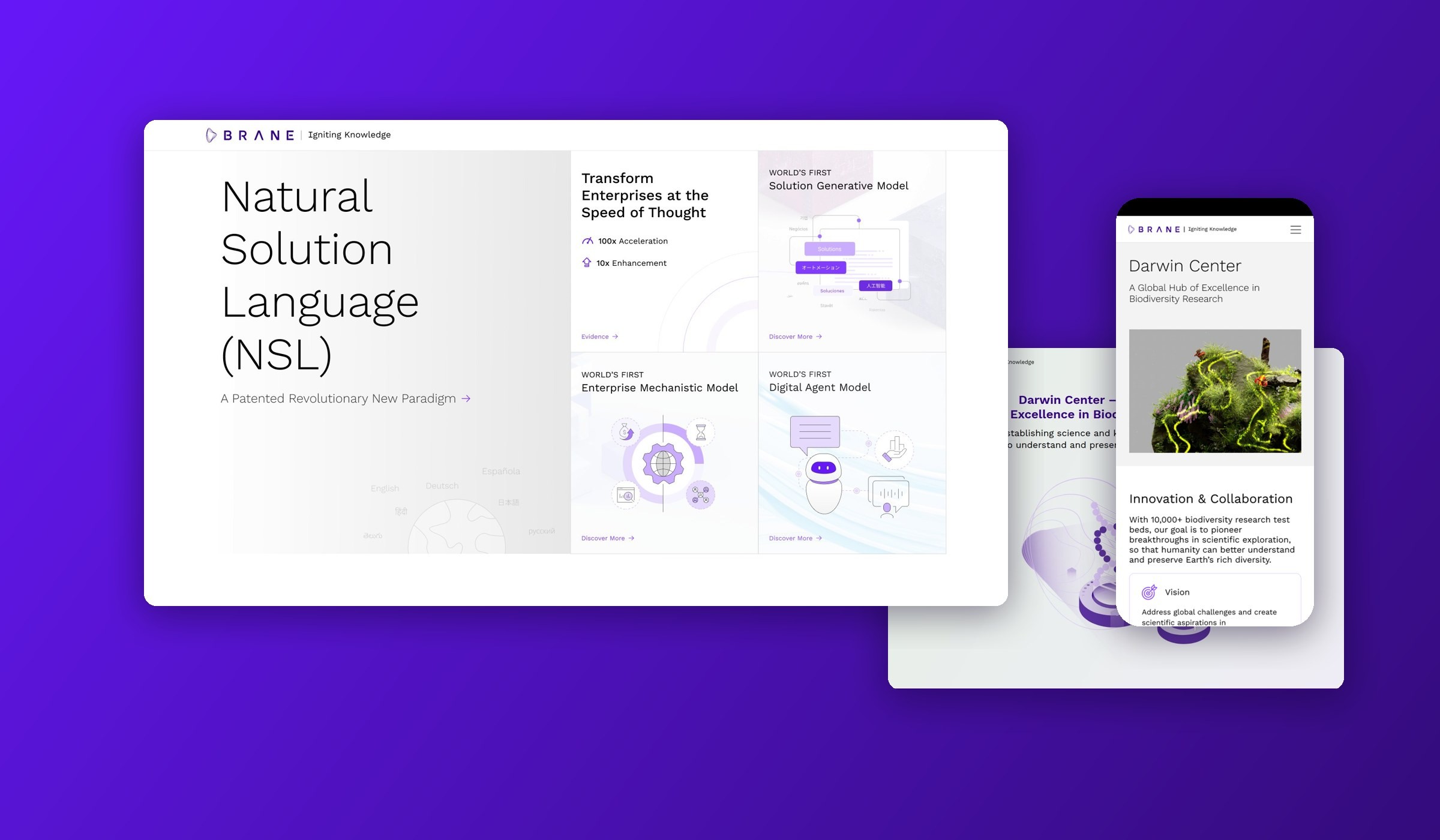
In October 2023 the home page opened with “A Revolutionary New Paradigm”. The three products sat under names like “World’s First Enterprise Mechanistic Model”. A buyer had to click to learn what any of them did.
Below that, fourteen evidence cards carried equal weight. A patent claim got the same space as a compliance badge.

braneenterprises.com in October 2023, from the Internet Archive.
“Existing AI tools felt too technical to plug into our own software.”
Paraphrased from our buyer interviews.
Problem statement
Buyers needed to understand NSL in the first scroll, without a sales call.
Goals
01
Say what it does. Plain words before product names.
02
Show proof people trust. Real industries and real clients, fewer claims.
03
One system. Every page built from the same parts.
Research
Two buyers, one question
The team ran 10 user interviews and a competitive audit. The interviews pointed to two kinds of buyer.
Persona 1
The technical buyer
IT directors, CTOs and solution architects.
Role Picks the platform.
Looks for Speed, security and scale.
Persona 2
The business buyer
CEOs, heads of operations and product owners.
Role Signs the budget.
Looks for Return, rollout time and fit with current systems.
What both of them asked
What does it do for me, and how fast?
The scope
73 pages in one file
One Figma file held the whole site: home, about, product pages, client stories, legal pages and mobile layouts.
73
desktop pages
7
home page versions
3
About Us versions
14
flow diagrams
23
client story frames
8
mobile layouts

Every desktop page in the file, each 1920 pixels wide.
What shipped
Five pages, still live
Before the redesign, I designed product pages inside Brane’s existing purple system. Five of them are still live on braneenterprises.com as of September 2026.

Darwin Center ↗
Brane’s hub for biodiversity research.

Digital CEO ↗
An AI agent for company operations, run on a private LLM.

Blockchain Solutions ↗
Blockchain as a service, configured through NSL.

Industries ↗
NSL by sector, from aerospace to banking.

Legacy Modernization ↗
Old code like COBOL moved to modern stacks.
What I noticed
Every page followed one recipe. A claim at the top, benefits in a grid of equal cards, then the purple band.
Fast to build, but every page looked like every other page.
The redesign
Seven tries at the first scroll
I redrew the home page seven times. Each version asked one question: how much can a stranger understand before they scroll?

Versions 1 and 2: one headline next to a big photo. The photos were lost when the file moved from XD to Figma, so they show gray here.

Versions 3 to 7: the product name first, then four tiles.

Versions 3 to 7 kept the four tiles and changed the drawings inside them.
Three decisions
Decision 1
Light pages, purple for action.
Why On the live site deep purple filled every hero, so nothing stood out. In the redesign the page is white, and purple marks buttons, links and the closing band.
Trade-off The site gave up some of its dramatic first impression.
Decision 2
Four tiles instead of three cards.
Why The first tile states the result in numbers, 100x acceleration and 10x enhancement. The other three show one model each, with a drawing of what it does.
Decision 3
Photos in place of abstract shapes.
Why Eight photo cards show where NSL runs: strategy rooms, industries, legacy systems, data centers. People and hardware replace the isometric shapes of the live site.
Product pages
Long pages people can follow
Brane’s product pages run long. The NSL page alone is 6,937 pixels tall. Three patterns keep a reader oriented.
Pattern 1
A side nav that tracks the section
Introduction, Invention, Founding Principles, Applications, Framework, Patents.
Pattern 2
One benefit per card
Each card gets one purple icon and one sentence.
Pattern 3
Diagrams for ideas words can’t carry
Like “Conventional way” drawn next to “NSL way”.

The NSL page: the side nav on the left, one benefit per card on the right.

The conventional way next to the NSL way.

How NSL translates code from one language to another.
Client stories
One template for every client
I designed case study pages for four Brane clients: an emergency services network, a health insurance plan administrator, a school and a healthcare platform. Every story runs the same four beats.
01
Overview
02
Business challenges
03
Approach
04
Impact

Emergency services network
Faster response times for ambulances.

Health insurance plan administrator
New pricing on top of an old mainframe.

School
An integrated ERP for the whole school.

Healthcare platform
Care delivery across a fragmented network.
Brane keeps these clients unnamed on its site, so they stay unnamed here.
Mobile
The same story at 375 pixels
The side nav and the four column footer don’t fit a phone. Sections became accordion rows and the menu moved behind one icon.
Terms like EMM and DAM got expandable info sections, so readers open a definition only when they need it.

Darwin Center on a phone. The menu labels repeat because the text was lost when the file moved from XD to Figma.
Visuals
Dashboards and drawings for Brane’s products
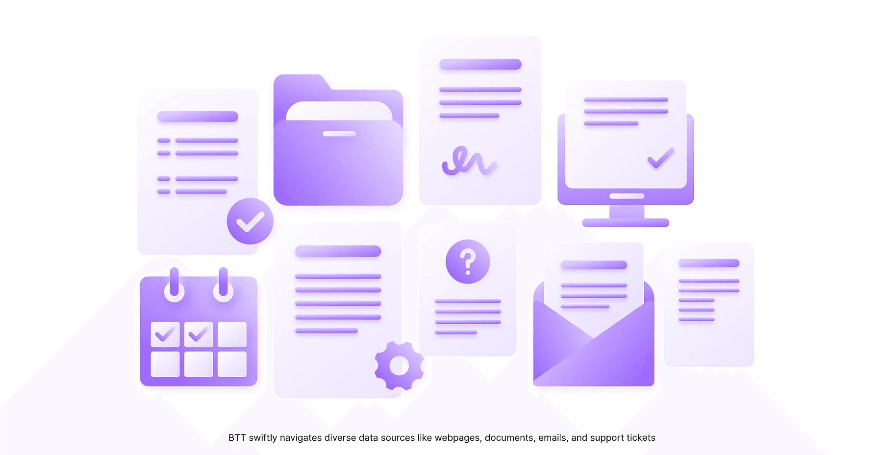
I designed product dashboards and illustrations for Brane’s pages and explainer videos, all inside the Brane brand guidelines.


The design system
73 pages, one library
Every page draws from one set of parts: four purples with fixed jobs, Work Sans with light headlines, hairline borders and square buttons.
175
tokens
18
text styles
22
components
2
modes, Light and Dark
Which purple, when
#813CFF
Anything you can click
#6718F8
Brand moments
#35008B
The logo and deep headings
#340C7C
The end of the gradient

Work Sans, light at display sizes.

Primitive scales, then role colors for Light and Dark.

One button in three sizes and four styles, on white and on purple.

24 pixel UI icons and 48 pixel feature icons.
What went wrong
The redesign never shipped
73 pages and 7 home versions stayed in Figma. The live home page still runs its 2023 layout.
01
I redesigned everything at once.
A full redesign needs every stakeholder to agree at the same time. Shipping the home page alone would have tested the idea in weeks.
02
Five purples crept in.
Five purple hex values lived in one file with no rule for which to use. The system folds them into four, each with one job.
#6607FF
#6718F8
#813CFF
#35008B
#340C7C
03
A gray that fails.
Form placeholders used #969696, under 3:1 contrast on white. Body text needs 4.5:1.
Enter your work email
04
49 components named by number.
The file held parts like “Component 3722”. A name like that tells a developer nothing.
Outcome
Five pages live, one system ready
Darwin Center, Digital CEO, Blockchain Solutions, Industries and Legacy Modernization are still live. The redesign stayed a proposal. Its parts sit in one Figma library, ready to build from.
5
pages live
73
page redesign
7
home page versions
22
components
Looking back
What I’d do differently
Ship one page first.
Put the new home page live and measure it before redrawing the other 72.
Name parts on day one.
A developer should find “Button/Primary”, not a number.
Fix contrast once, in the tokens.
A token fix reaches every page. Page by page fixes drift.
Show proof a buyer can check.
Client results and real numbers in place of claims like “World’s First”.